

If you have worked with text effects, then you may have noticed that it’s not immediately intuitive to add both a text gradient and a text shadow. Without assumption, one may be surprised to discover that the text shadow is placed on top of the text gradient.
For some reason, the Chipmunks were on my mind, soooo…
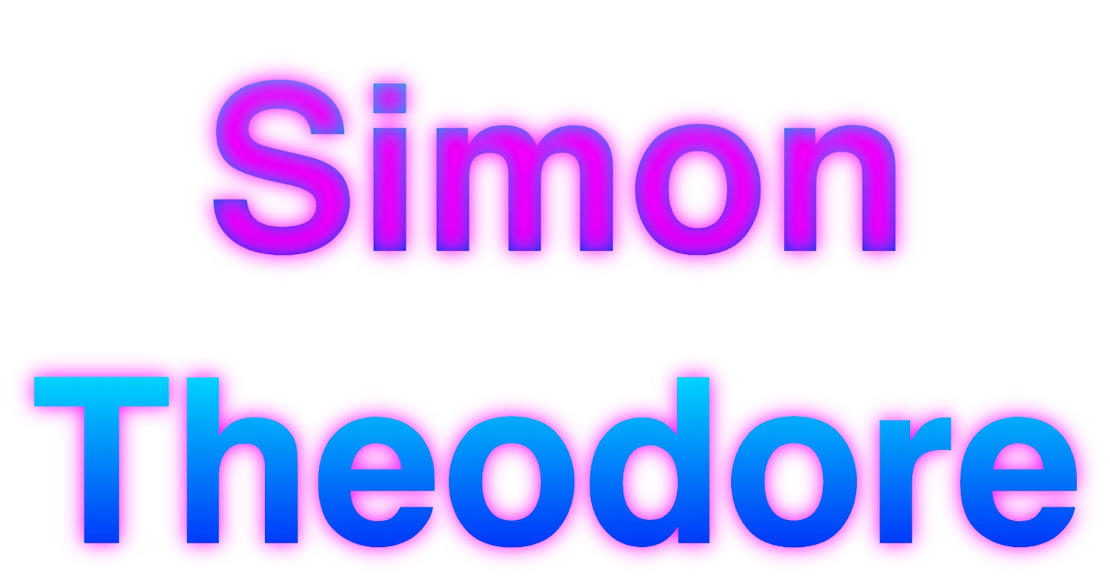
“Alvin” has the text gradient applied. But if you try to add a text shadow to the same CSS code, the result looks like “Simon.” Upon investigation, I found a hack that results in “Theodore.”
Basically, it involves adding a <span> element with display: block inside of an <h1> element; then making the <h1> element position: relative and the <span> element position: absolute. With the ::after pseudo element I was able to add the text shadow underneath the text gradient. Magic!
What’s interesting is that the W3C does not yet recommend background-clip: text; however, the WHATWG recommends -webkit-background-clip: text.
A logo I designed recently necessitated these two effects (I find it’s pretty common in the graphic design world), but I was going to have to forego one of these effects because I couldn’t figure out how to add both and make them look good. However, with persistence I present it to you in all its glory!